Heatmaps are a common way to visualize matrices and R provides a variety of methods to generate these diagrams. One of the key features of a heatmap is the color scheme employed. By default the image method uses heat.colors which ranges from red (lowest values) to white (highest values). Other palettes include rainbow and topographical. However, I needed to replicate a color scheme used in a previous publication – dark red for low values and white for high values, passing through shades of pink. While RColorBrewer is an extremely useful package for generating sensible and informative color schemes it didn’t help me out here – the red palette was limited to 9 colors, whereas I needed a larger range. There’s also the colorschemes method from the ClassDiscovery package, but I haven’t checked that out.
So, I ended up making my own color scheme, realizing that shades of pink are a constant red, coupled with increasing amounts of blue and green (in the RGB scheme). Thus generating a matrix of R, G and B values, with a constant red value and increasing blue and green values and then converting the rows to hex colors (via rgb, gives me the required colors.
1 2 3 4 | rgbs <- cbind(255, seq(32,255, length=256), seq(32,255, length=256)) / 255 cols <- rgb(rgbs[,1], rgbs[,2], rgbs[,3]) |
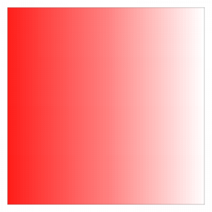
and an example of the color scheme
1 2 | image(matrix(1:256, nrow=64, byrow=TRUE), col=cols) |

when I was looking at colour maps, I found this to be a great help
http://local.wasp.uwa.edu.au/~pbourke/texture_colour/colourramp/
Richard, thanks for the pointer. This is a very handy resource