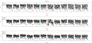
Plate well series plots are a common way to summarize well level data across multiple plates in a high throughput screen. An example can be seen in Zhang et al. As I’ve been working with RNAi screens, this visualization has been a useful way to summarize screening data and the various transformations on that data. It’s fundamentally a simple scatter plot, with some extra annotations. Though the x-axis is labeled with plate number, the values on the x-axis are actually well locations. The y-axis is usually the signal from that well.
Since I use it often, here’s some code that will generate such a plot. The input is a list of matrices or data.frames, where each matrix or data.frame represents a plate. In addition you need to specify a “plate map” – a character matrix indicating whether a well is a sample, (“c”) positive control (“p”), negative control (“n”) or ignored (“x”). The code looks like
1 2 3 4 5 6 7 8 9 10 11 12 13 14 15 16 17 18 19 20 21 22 23 24 25 26 | plate.well.series <- function(plate.list, plate.map, draw.sep = TRUE, color=TRUE, ...) { signals <- unlist(lapply(plate.list, as.numeric)) nwell <- prod(dim(plate.list[[1]])) nplate <- length(signals) / nwell cols <- 'black' if (color) { pcolor <- 'red' ncolor <- 'green' colormat <- matrix(0, nrow=nrow(plate.list[[1]]), ncol=ncol(plate.list[[1]])) colormat[which(plate.map == 'n')] <- ncolor colormat[which(plate.map == 'p')] <- pcolor colormat[which(plate.map == 'c')] <- 'black' cols <- sapply(1:nwell, function(x) { as.character(colormat) }) } plot(signals, xaxt='n', ylab='Signal', xlab='Plate Number', col = cols, ...) if (color) legend('topleft', bty='n', fill=c(ncolor, pcolor, 'black'), legend=c('Negative', 'Positive', 'Sample'), y.intersp=1.2) if (draw.sep) { for (i in seq(1, length(signals)+nwell, by=nwell)) abline(v=i, col='grey') } axis(side=1, at = seq(1, length(signals), by=nwell) + (nwell/2), labels=1:nplate) } |
An example of such a plot is below
Another example comparing normalized data from three runs of an RNAi screen investigating drug sensitization (also highlighting the fact that plate 7 in the 5nm run was messed up):


Hi,
Thank you for sharing this code.
I am new to R and trying to run your code but
am unable to do so. Can you please let me know what the format of the plate.list and plate.map should be. I have many 384 well plates with different controls in different locations. How can i get this code to owrk?
Thank you.
Hi Maziz, a plate.list is just a list of data.frames, with the 1,1 element representing the top left of the plate. A plate.map is a matrix or data.frame in which all elements are characters. Sample wells are ‘c’, positive and negative controls are ‘p’ and ‘n’ respectively. wells labeled ‘x’ are ignored