In a previous post, I dicussed virtual screening benchmarks and some new public datasets for this purpose. I recently improved the performance of the CDK hashed fingerprints and the next question that arose is whether the CDK fingerprints are any good. With these new datasets, I decided to quantitatively measure how the CDK fingerprints compare to some other well known fingerprints.
Update – there was a small bug in the calculations used to generate the enrichment curves in this post. The bug is now fixed. The conclusions don’t change in a significant way. To get the latest (and more) results you should take a look here.
Background
Benchmarking strategies to compare fingerprint performance have been described by Bender & Glen and Godden et al. We take an active molecule as the query. We then create a “target” collection of non-active molecules (decoys) and also add several other actives. We then evaluate the Tanimoto similarity between the query and each compound in the target collection. The target collection is then ranked in order of decreasing similarity. The hope is that a good fingerprint will cause the actives in the target collection to be highly ranked. The extent to which this occurs is a measure of the effectiveness of the fingerprint. The Curious Wavefunction has a good post on datasets and performance measurements for virtual screening methods.
How do we measure performance quantitatively? One way to do this is by evaluating enrichment curves. The process first looks at, say, the top 1% of the ranked target collection and counts what fraction of all the actives lie within this portion. The process is then repeated with increasing percentages. The goal of a fingerprint (or any other virtual screening method) is to have a large fraction of the actives when we consider a low percentage of the target collection, since this would theoretically allow us to look at just, say, 5% of the whole target collection to get the all actives.
Note, while the use of enrichment curves is common, it is not necessarily the most appropriate measure of performance and has been discussed by Hawkins et al. Alternative methods such as ROC curves and the RIE metric are more rigorous and robust. But it took 10 minutes to write the code to get the enrichment curves (and factors), so that’s what I’ll use here.
Procedure
So with this procedure in hand, I considered two of the datasets provided by Rohrer & Baumann. Specifically, I used AID’s 466 and 548 (which were cleaned locally). Each of these datasets had 30 actives and 15,000 decoys. I combined the actives with the decoys and obtained enrichment curves using each of the actives against the 15,030 compound target collection. The final enrichment curve was then obtained by averaging the 30 individual enrichment curves.
This procedure was performed using 5 different fingerprints, and in all cases the Tanimoto metric was employed.
- BCI 1052 bit structural keys
- MACCS 166 bit structural keys (implemented in the CDK)
- EState 79 bit structural keys (implemented in the CDK)
- CDK 1024 bit standard hashed (ignores cyclic systems)
- CDK 1024 bit extended hashed (considers cyclic systems)
Results
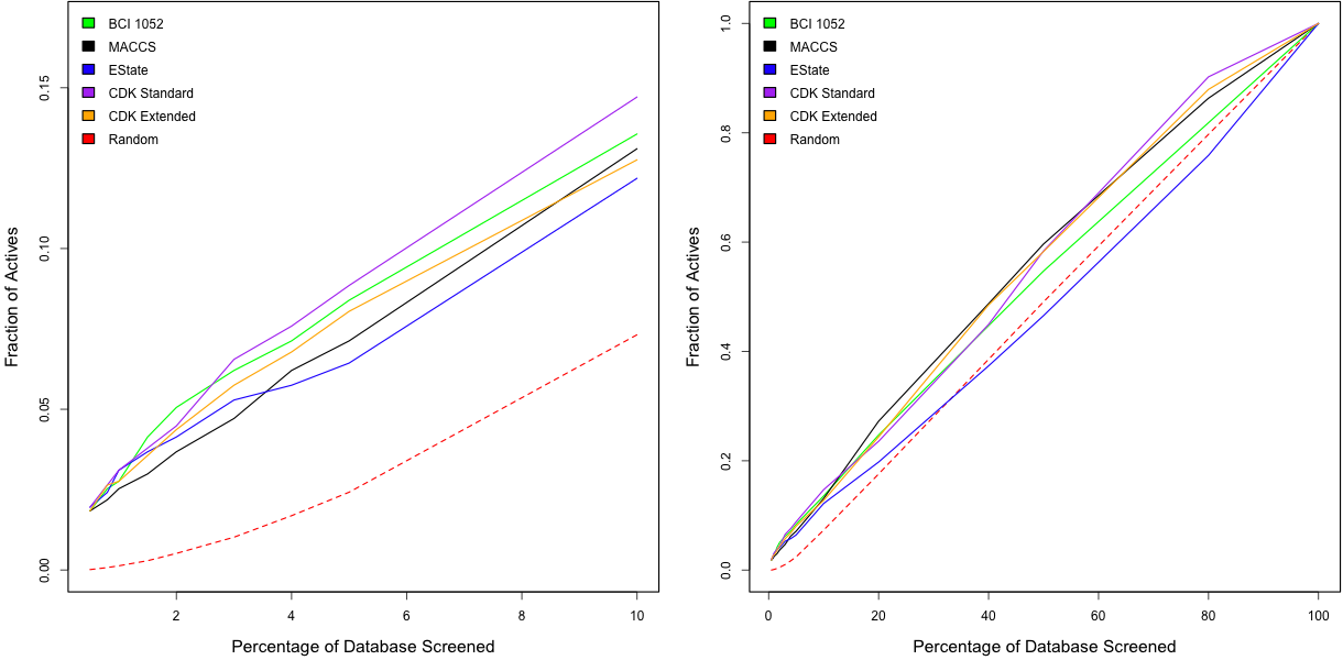
The plots below compare the performance of the five fingerprints for the AID 466 dataset. Looking at the right hand plot, we see that overall none of the fingerprints are doing too great. More interesting is the left hand plot which focuses on the smaller percentages of the target collection. Here we see that the standard CDK hashed fingerprint is actually performing quite similarly to the BCI 1052 structural keys. Surprisingly the extended CDK fingerprints don’t seem to be doing so well, even though it takes into account more features.
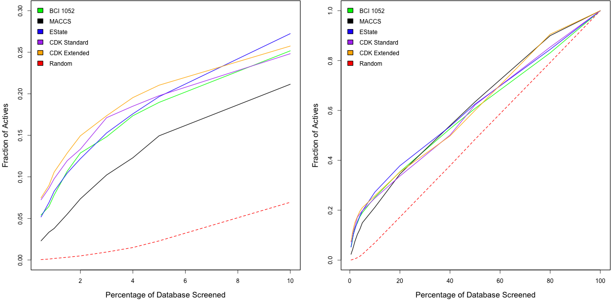
The figure below shows the results for the same give fingerprints applied to the 548 dataset. As noted above, enrichment curves are dependent on the dataset being analyzed. For this dataset, all the fingerprints exhibit better performance. In this case, the CDK extended fingerprint appears to be doing the best. Surprisingly the BCI keys are outperformed by the two CDK hashed fingerprints.
It’s also useful to look at the enrichment factors for, say , the top 5% of the target collection and are listed below for the five fingerprints
| Dataset | BCI | MACCS | EState | CDK Standard | CDK Extended |
| 466 | 1.67 | 1.42 | 1.28 | 1.77 | 1.61 |
| 548 | 3.79 | 2.98 | 3.93 | 3.95 | 4.21 |
The overall performance of all the fingerprints is not great – but this is not surprising, since the datasets have been constructed to have a high degree of scaffold diversity. Such datasets are designed not to unduly favor 2D fingerprint methods. While these results are not conclusive, and should be repeated for more datasets (and I’d also like to see how circular fingerprints perform on these datasets), they do suggest that the simplistic CDK hashed fingerprints are not too bad.


Very interesting results, Rajarshi. If memory serves, the CDK hashed fingerprints are based on paths of length 6. Many pharmacophores extend further than 6 atoms.
What do you expect to happen to happen to the enrichment curves as the length of the paths considered, and possibly the number of bits, in the fingerprint increases? What’s the performance trade-off?
Rich, you’re right about the default path length being 6. Indeed, I didn’t expect the CDK fp’s to compare as well as they do to the BCI keys.
By increasing the path length, we might get better performance in terms of retrieval – but I think this will only go so far, since linear paths are only part of the story. Regarding time performance – there’ll certainly be a hit, but not too bad. Of course, without profiling & benchmarking, this is all guesswork
Similar arguments can hold for fingerprint size. Clearly, the MACCS generally performs the poorest and one might think that increasing the bit length would help things. It will to a certain extent – but I believe that it’s the actual substructures that are being considered that are key.
An example is the EState FP’s – arguably, these substructures are more ‘pharmacophoric’ than those in CDK FP’s or even MACCS. As a result, even though it’s just 79 bits, it outperforms MACCS in the second benchmark. In this sense, my guess is that something like ECFP’s or Molprint2D will perform best, due to the nature of the substructures they identify.
Great work – thanks a lot.
Quite a while ago already, I had set the DEFAULT_SEARCH_DEPTH = 8, to that the default path length should be 8. The reasoning was that this helps finding and taking into account ring closures in the most common ring systems.
I’m also surprised that taking into account ring sizes and counts, as done by the ExtendedFingerprinter, does actually decrease performance.
Christoph, I can only image this to be an effect of the bit size for the path-derived bit… the ExtendedFP uses a shorted (normal) Fingerprinter, and uses the difference with 1024 for the rings… if the ExtendedFP would be 1024 *plus* the bits for ring systems, it should behave equal or better than the standard FP…
The extra bits used by the ExtendedFP is 25… Rajarshi, you can set the size of the ExtendedFP in the constructor to 1047, and then it should basically use a default Fingerprinter, and then the you can see the effect of just adding the ring bits… Right now, the difference is confounded effect of the added bits and reducing the size of the Fingerprinter to 999.
Probably a silly question, but why doesn’t your ‘random’ enrichment curve go from (0%,0%) to (100%,100%)?
@mikaelhc, I think they do. At least on the right hand plots, where the X axis goes from 0-100
Sorry to disturb you again: it might be that I am missing something, but I really cannot understand these graphs:
I think that especially the left plots quite clearly show a non-linear curve. Also, the random enrichment is approximately half the size of what I would expect. In the tables you also list random enrichments, all about 0.5 – I would expect this number to be 1.0.
Where do the random enrichment numbers come from? Are they simulated and averaged over 30 runs as well?
I also have another questions wrt the procedure. You say you have 15030 compounds (15000 decoys + 30 actives). You then screen each of the 30 actives for similarity with the 15030 compound set, if I understand you correctly. But to make a fair test, I think you should consider ‘holding out’ the active compound from the test set (you should test how many of the 29 other actives a given active could recover). This could make a big difference in the graphs, since you actually giving away a ~3.3% hit fraction ‘for free’.
I’m not exactly sure why the random curve in the left hand plots are curved – possibly due to the fact that the calculations were done with one randomization.
The random curve is obtained by multiple shufflings which are then averaged.
I’m not sure why the 30 actives should be held out – the goal is to see if, given an active, can the remaining actives be be retrieved if they are located amongst the inactives. Or maybe I have misunderstood?
I pretty sure that the theoretical random curve should just be the (linear) diagonal. (If you take out 10% of your set at random, you would expect to find 10% of the actives). So I think your random curve is misleading low.
Instead of shuffling the compounds, try to assign a random number (a random ‘affinity’) to each of the compounds and then sort them. Achieving randomization through shuffling can be difficult, see e.g. http://en.wikipedia.org/wiki/Shuffling (the section about “Poorly implemented Knuth shuffles”)
Wrt to the ‘hold-out’:
I do not think you misunderstood – I just probably did not make myself clear: I did not mean to hold out the entire set of the 30 actives.
As I understand it, you choose 1 ‘reference’ active compound, and then you screen this reference compound for similarity with the 15030 (15000 decoys + 30 actives) compounds in your set. This is then repeated for all the 30 actives and the enrichments are averaged. (Please correct me, If I misunderstood this).
Now, I think it would be more fair to exclude the reference compound from the big set of compounds: so you choose 1 reference compound and screen for similarity against the 15029 (15000 decoys + 29 other actives) other compounds. And then repeat this for all 30 actives. It might not seems like a big deal, but I believe it could change the curves quite dramatically as compared to the random enrichments.
It might also be that you are already doing it this way – it is just a suggestion for obtaining a more fair baseline when comparing with the random enrichment.
I’ve always thought that randomness presented as a diagonal line between opposite corners is misleading. It would be nice to see the curves of the 1st quartile (i.e. 66% or so of random curves are between here and here), although very few people do this.
[…] wrote a post about benchmarking of different type of fingerprints with benchmarking strategies described by […]
[…] the utility of the fingerprint in a virtual screening scenario I evaluated enrichment curves (see here for a comprehensive comparison of CDK fingerprints) using the AID 692 MUV benchmark dataset. The […]