Recently Barbara Zdrazil and I published an article that explored the idea of tracking the attention being paid to a scaffold in the medicinal chemistry literature (as represented by ChEMBL). The gist of the idea is that scaffolds that are more frequently enumerated or tested in more assays (or even published in increasingly high IF journals) are receiving more attention than ones that are less frequently enumerated and so on. By fitting robust regression models to per-year scaffold-aggregated properties we identified significant vs non-significant trends.
The idea originated from a blog post (archived version) by Jonathan Baell, where he traced the publication history of the bis-chalcone scaffold starting from Stoll et al, Biochemistry, 2001 ending up at Anchoori et al, Cancer Cell, 2013, the point being that a PAINS containing scaffold (and thus of possibly dubious biological activity) received increasing attention resulting in a (relatively) high profile journal publication. This led to the question of whether we could systematically capture such attention trends for other scaffolds and thus this paper.
While the article presents a comprehensive analysis, it is limited to using a fixed set of scaffolds (defined using the Bemis-Murcko scheme) and a few properties we selected because we thought they would be proxies of attention. What if we could consider any scaffold? And visualize the time evolution of an arbitrary scaffold-aggregated property over time? This would be something like Google Trends – except that instead of text search terms, you’d be comparing scaffolds.
So I put together the Scaffold Trend Explorer, which allows you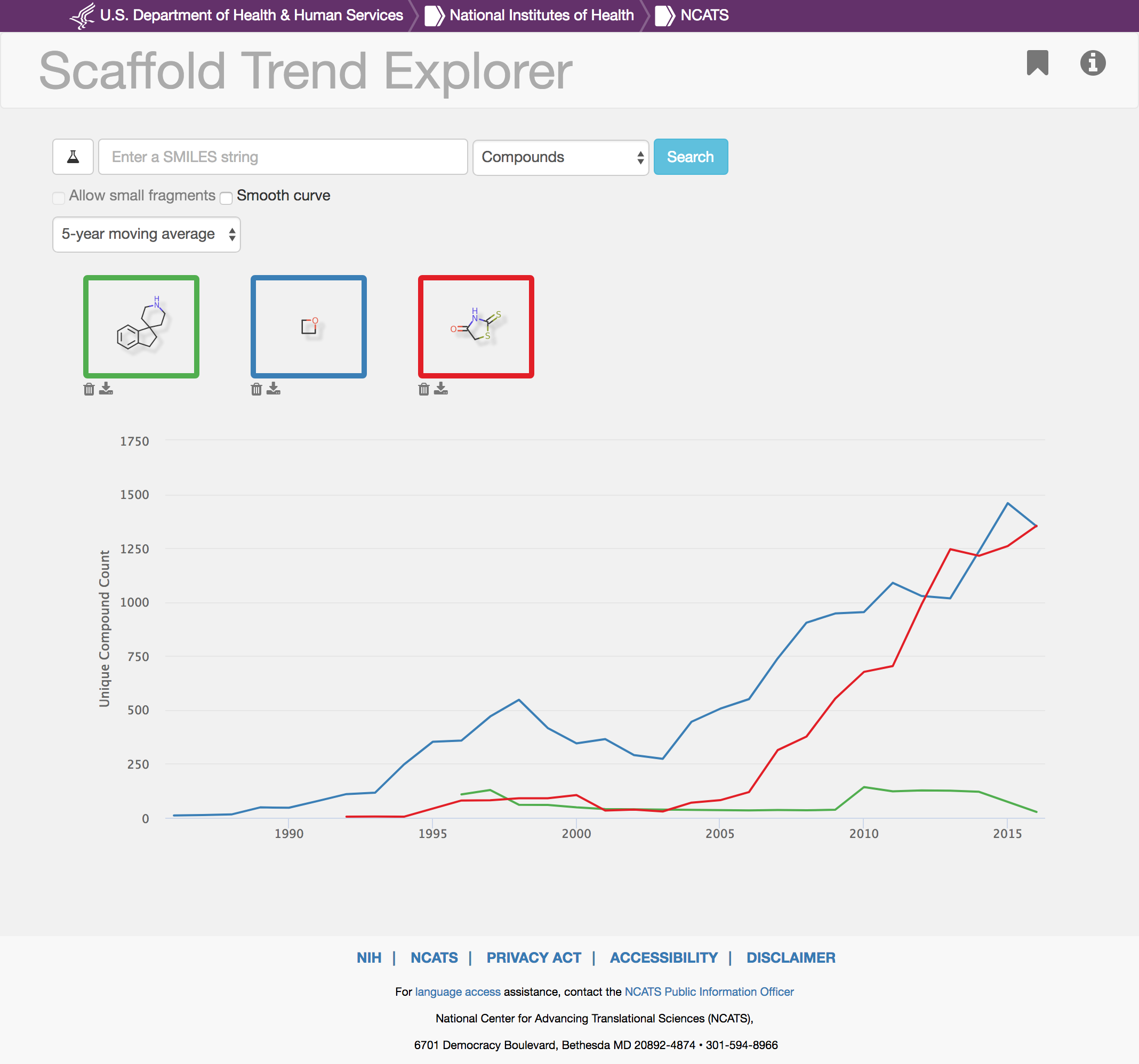 to view trends for a number of properties, for arbitrary substructures. Obviously, searching for frequent substructures will probably be non-responsive (so I disallow queries such as benzene and straight chain alkanes with < 8 carbons). I’ve provided a number of properties ranging from the count of enumerated compounds to drug-likeness. You can draw a structure or provide the SMILES directly. In addition there is a set of bookmarks for well known scaffolds (taken from Welsch et al, 2010). You can compare multiple (up to 9) scaffolds at a time, and compute moving window average curves, which hides the year to year variation.
This tool should let users play around with the idea of scaffold trends. Currently, it’s a very simple visualization tool – you can download the per-year data, but that’s it. Unlike the paper, I don’t fit regression lines, though I hope to implement this in the future. There’s a number of enhancements planned, including access to the underlying publications for a scaffold in a given year, simple analytics (such as differential analysis) on trends and so on. A natural next step is to go beyond the medchem literature and consider patents as well (say, via SureChEMBL). And of course, feature requests are also welcome.