Waterfall plots are a common visualization method to view multiple spectra and have some similarities with joy plots. In the high throughput screening world, people have plot multiple dose response curves, offset on the z-axis to produce something that looks like a waterfall. An example is Figure 1 in Inglese et al, PNAS, 2006, 103(31). In my opinion, such visualizations are not much more than eye candy and not particulary informative, though it helps if the curves to be displayed are picked carefully so that they can be differentiated in the plot. However, people seem to like them and I’ve been asked to generate them based on dose response fit parameters.
Here’s an implementation using rgl, which results in an interactive waterfall plot. An example of the output is shown below
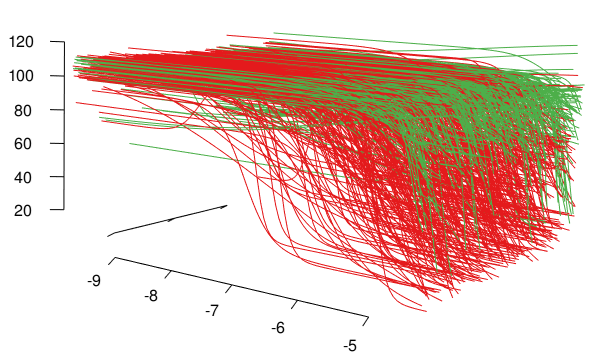
A waterfall plot for active (red) and inconclusive (green) dose response curves
1 2 3 4 5 6 7 8 9 10 11 12 13 14 15 16 17 18 19 20 21 22 23 24 25 26 27 28 29 30 31 32 33 34 35 36 37 38 | library(rgl) library(RColorBrewer) ## Get view parameters we set previously load('http://blog.rguha.net/wp-content/uploads/2017/09/waterfall-view.rda') ## Set up colors for curve types pal <- as.list(brewer.pal(3, "Set1")) names(pal) <- c('active', 'inactive', 'inconc') cdata <- read.csv('http://blog.rguha.net/wp-content/uploads/2017/09/curves.csv', header=TRUE) interleave <- function(x) { unlist(lapply(1:(length(x)-1), function(i) c(x[i], x[i+1]))) } f <- function(params, concs, interleave=TRUE) { xx <- seq(min(concs)*1.1, max(concs)*1.1, length=100) yy <- with(params, ZERO + (INF-ZERO)/(1 + 10^( (LAC50-xx)*HILL) )) if (interleave) { xx <- interleave(xx) yy <- interleave(yy) } return(data.frame(x=xx, y=yy)) } open3d(scale=c(150, 3.5, 1), userMatrix = userMatrix, windowRect=windowRect) for (i in 1:nrow(cdata)) { d1 <- data.frame(f(cdata[i,], c(-9, -4)),z=i) segments3d(x=d1[,1], y=d1[,2], z=d1[,3], col=pal[[cdata$klass[i]]]) } axis3d('x-+', ntick=5) axis3d('y-+', ntick=5) axis3d('z--', labels=FALSE, tick=TRUE) title3d(xlab="log Concentration",ylab="Response",zlab="") |