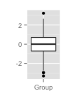
I was browsing live notes from the recent IEEE conference on visualization and came across a paper about functional boxplots. The idea is an extension of the boxplot visualization (shown alongside), to a set of functions. Intuitively, one can think of a functional box plot as specific envelopes for a set of functions. The construction of this plot is based on the notion of band depth (see the more general concept of data depth) which is a measure of how far a given function is from the collection of functions. As described in Sun & Genton the band depth for a given function can be computed by randomly selecting \(J\) functions and identifying wether the given function is contained within the minimum and maximum of the \(J \) functions. Repeating this multiple times, the fraction of times that the given function is fully contained within the \(J\) random functions gives the band depth, \(BD_j\). This is then used to order the functions, allowing one to compute a 50% band, analogous to the IQR in a traditional boxplot. There are more details (choice of \(J\), partial bounding, etc.) described in the papers and links above.
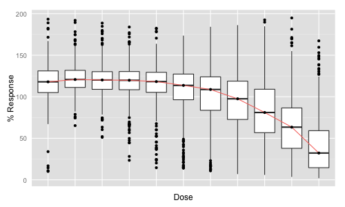 My interest in this approach was piqued since one way of summarizing a dose response screen, or comparing dose response data across multiple conditions is to generate a box plot of a single curve fit parameter – say, \(\log IC_{50} \). But if we wanted to consider the curves themselves, we have a few options. We could simply plot all of them, using translucency to avoid a blob. But this doesn’t scale visually. Another option, on the left, is to draw a series of box plots, one for each dose, and then optionally join the median of each boxplot giving a “median curve”. While these vary in their degree of utility, the idea of summarizing the distribution of a set of curves, and being able to compare these distributions is attractive. Functional box plots look like a way to do this. (A cool thing about functional boxplots is that they can be extended to multivariate functions such as surfaces and so on. See Mirzargar et al for examples)
Computing \(BD_j\) can be time consuming if the number of curves is large or \(J\) is large. Lopez-Pintado & Jornsten suggest a simple optimization to speed up this step, and for the special case of \(J = 2\), Sun et al proposed a ranking based procedure that scales to thousands of curves. The latter is implemented in the fda package for R which also generates the final functional box plots.
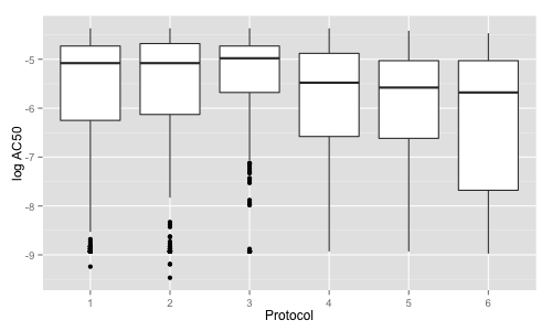
As an example I considered 6 cell proliferation assays run in dose response, each one running the same set of compounds, but under different growth conditions. For each assay I only considered good quality curves (giving from 349 to 602 curves). The first plot compares the actives identified in the different growth conditions using the \(\log IC_{50}\), and indicates a statistically significant increase in potency in the last three conditions compared to the first three.
In contrast, the functional box plots for the 6 assays, suggest a somewhat different picture (% Response = 100 corresponds to no cell kill and 0 corresponds to full cell kill).
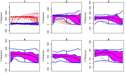
The red dashed curves correspond to outliers and the blue lines correspond to the ‘maximum’ and ‘minimum’ curves (analogous to the whiskers of the traditional boxplot). Importantly, these are not measured curves, but instead correspond to the dose-wise maximum (and minimum) of the real curves. The pink region represents 50% of the curves and the black line represents the (virtual) median curve. In each case the X-axis corresponds to dose (unlabeled to save space). Personally, I think this visualization is a little cleaner than the dose-wise box plot shown above.
The mess of red lines in the plot 1 suggest an issue with the assay itself. While the other plots do show differences, it’s not clear what one can conclude from this. For example, in the plot for 4, the dip on the left hand side (i.e., low dose) could suggest that there is a degree of cytotoxicity, which is comparatively less in 3, 5 and 6. Interestingly none of the median curves are really sigmoidal, suggesting that the distribution of dose responses has substantial variance.